Over the last few years, I repeatedly found myself thinking about a seemingly trivial topic: why there are errors in software, what can be done about it, and how close we can get to perfect software. While getting to perfection often requires so much time that it becomes impractical, the question of “how close is close enough” is worth exploring. This post is a collection of my thoughts on the topic.
Virtually all software contains errors, and end users have become so used to them over the years that they don’t even seem to consciously notice if they’re below a threshold.
Two basics that every software engineer intuitively understands about errors:
- Errors are unintended behavior. When something isn’t working as it should.
- Not all errors are created equal. The variance in criticality and impact is very high. Think of an error that takes down a production system vs a minor visual glitch that goes unnoticed for months.
These are both true, but there’s a lot more to them. Let’s explore further.
Internal vs external errors
There’s a crucial distinction to be made between internal and external errors. Let’s take a weather app for sake of an example.
- Internal errors are an issue with the software system itself. In our app, this could be the app crashing or presenting information incorrectly.
- External errors are issues that are caused by an external dependency/service/agent but affect the end user experience regardless. In our app, this could be the weather API / meteorological station going down. In the real world, there are a whole host of issues in this category, such as cloud provider issues, external APIs, defects on the host platform/OS, bugs in the programming language, frameworks or libraries. Even cosmic rays.
Mapping out external dependencies and generally being aware of those risks is crucial to do for any good software architect, because end users don’t typically care about internal/external issues – they just perceive the app as simply “not working.”
What is an error?
To understand errors, let’s think of a software system as a state machine. The “state” here means all data that would be necessary to replicate the app’s behaviour/data/state as it was at a given point. In a web app example, this might include all Redux/React state, any data stored locally and in persistent databases.
If we take all possible states an app can be in, and make an edge between two nodes whenever a user can transition from one state to the other, we get a huge “state graph”.
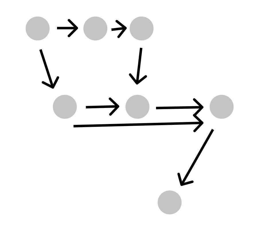
When a user uses an app, they go down a given path on the graph of all possible uses (I’m using app interchangably with software for simplicity). On this graph, each node is a possible valid state, and each connection is a directed edge indicating that you can go from state A → B.
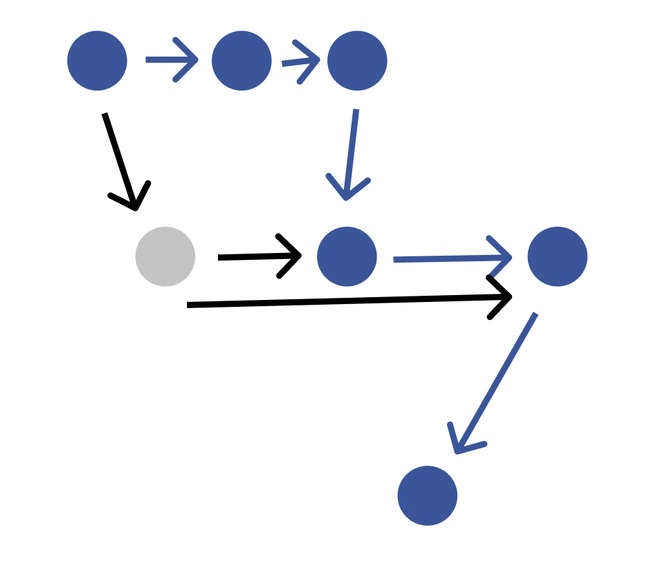
Now, think of an app that is in production and has 1M active users. Let’s imagine that we track every user, and we look at what "paths" they traverse as they use the app, and for each "use," we add a little weight to the edges in the path traversed. For example, if we were measuring Uber, then the "path" for ordering a ride (setting a destination → selecting car type → requesting ride) would have edges with extremely high weights. Note that this Uber example is simplistic and that in reality, the path for ordering a ride would not be one path, it’d be many paths (every possible combination of locale, destination, car type, user email etc would produce a different state).
Interestingly, users, especially younger ones seem to intuitively understand the concept of the state graph – if they observe an error, they immediately attempt to go back to a known, working state and retry what they were doing (for example, refreshing the page, reopening the app, etc).
As an aside, in many product/engineering teams, structures similar to this graph emerge in the form of user stories, diagrams and user flows/prototypes in figma. The fundamental concept is the same, however, these are always representing a subset of the state that’s deemed significant (eg. which screen the user is currently on), but not the raw state itself – to use an analogy, the specs are the map, the state graph is the actual territory.
Since there can often be infinite state permutations in even simple apps, a hallmark of outstanding PMs/engineers is the ability to judge which parts of the state are significant versus which aren’t.
The Bitcoin state machine
This model isn’t limited to just apps, or backend systems. If we take a look at let’s say bitcoin, a bitcoin implementation is a piece of software too, with many computers running it and the same state synced across them from time to time.
In the state graph, nodes would be snapshots of the blockchain database, and the edges would be possible interactions with a bitcoin node, ie. submitting transactions or mining new blocks (including submitting invalid transactions or blocks).
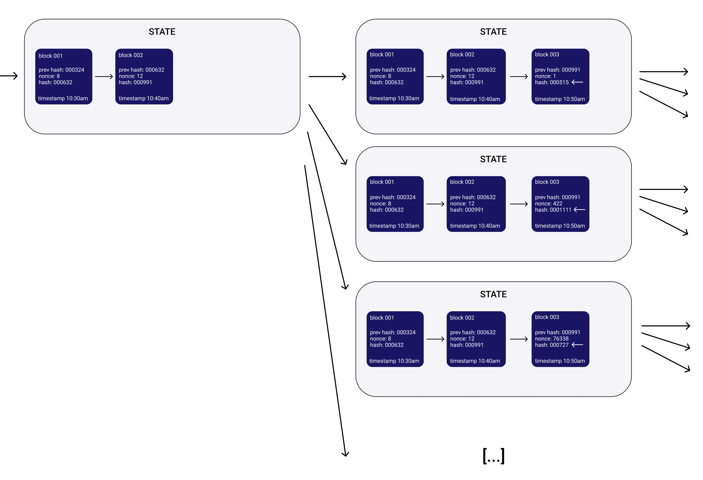
In the example above, each state box is a node on the state graph, in this case they each contain a valid snapshot of the blockchain. Notice that for any given block, there exist many valid subsequent blocks (with nonces 1, 422, 76338 here indicated by the white arrows), it’s just that they’re unknown at the time. When two miners find two valid blocks for the same ancestor, one becomes an orphan and the network continues mining on the longer chain. Since the miners aren’t incentivized to mine successors to blocks that aren’t the newest block, it will never be known what the potential successors of a block could have been (unless one actor irrationally mines them manually).
It’s clear that the state graph is infinite and cannot be known ahead of time (since the block hashes and nonces are part of the state), or in retrospect (as we just saw). If we were implementing bitcoin, it’d be futile to try to construct a state graph and attention would instead have to be paid to the underlying pattern of hashing the block hash + nonce until the resulting hash begins with a given number of zeroes.
Upon further thought, it becomes clear that many (most?) real-world systems have a state graph with infinite state nodes, with the set of nodes having continuum cardinality. Why? Because anything that has dynamic user input (eg. text), timestamps or any random/continuous input creates a continuum infinite set of possible states. The individual states are themselves finite, but the number of possible states (ie. the nodes on the graph) is infinite.
Quality as a percentage
The sum of all weights on this graph would represent every possible use of the app. And by comparing the weight of an edge or path, we can see the impact of the error. For example, if a user path with a 1,000 weight failed in an app where the whole graph adds up to 5,000, then the error will roughly affect 20% of users (or more precisely, 20% of uses).
Note that based on anecdotal evidence, the distribution of use paths and what percentage of all uses they make up, the distribution tends to have a relatively short and high peak of the most commonly walked paths, and a long tail of edge cases and rarely encountered scenarios.
This leads us to understanding reliability:
The reliability of a software is the ratio of working use paths vs the total number of use paths.
Or, phrased another way:
Software reliability is the complement of the probability that a real-world use, randomly sampled from all uses, will fail.
Note that what matters is percentage of real-world uses, not the percentage of all possible uses. For example, an app may have 50 features with 10 of them making up 80% of actual uses (Pareto principle applies here too). If one such feature goes down, it might only represent 2% of the surface area of features, but 20% of the actual uses of the app. The latter is what counts.
When dealing with software reliability, true perfection is virtually impossible. Instead, the scale that matters is the percentage of use paths that work – eg. 99.5% means that 99.5% of all uses of the app are working. In this sense, reliability percentages could be comparable to SLAs where the number of 9s are specified in uptime (eg. 99.999% is five 9s). However, uptimes can easily be monitored while there doesn’t yet appear to be an easy way of accurately measure reliability percentages in a similar fashion (unfortunately).
Using these in practice
The real value of this model – even if constructing actual state graphs is impractical – is using it as a mental framework for software design. It’s also a great thinking tool to use to write better automated tests.
Lastly, remember that detecting and planning with risks for external errors is crucial when planning, because they will contribute equally to the bottom line. If a software system is built on a critical external component that fails 20% of the time, then even if the software is 99.9% correct, the end result will still only be 79.9%. In practice, there’s often little that you can do about external error risk beyond doing good planning at the start.